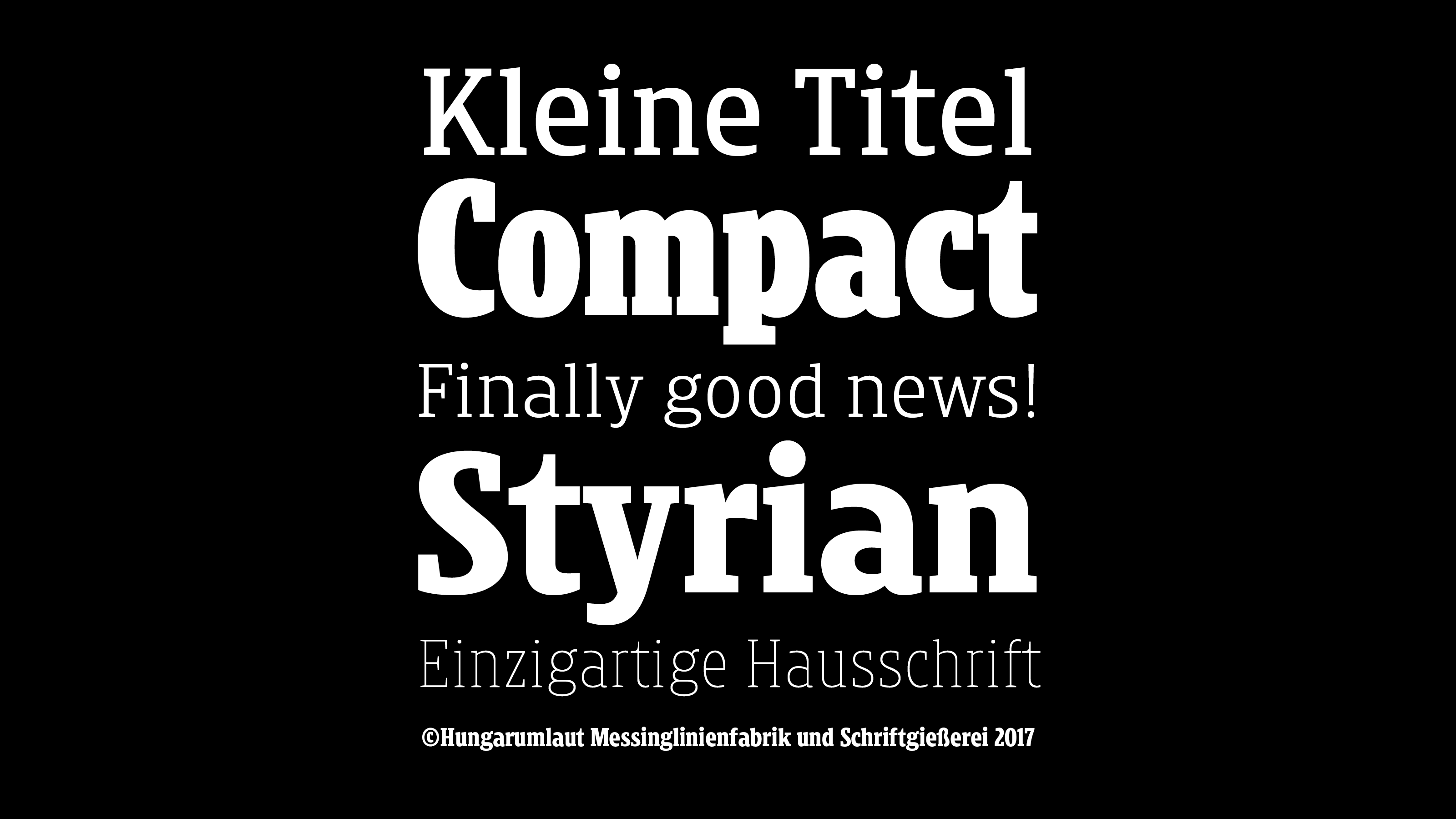
Kleine Titel is a custom typeface for the styrian Kleine Zeitung daily newspaper.
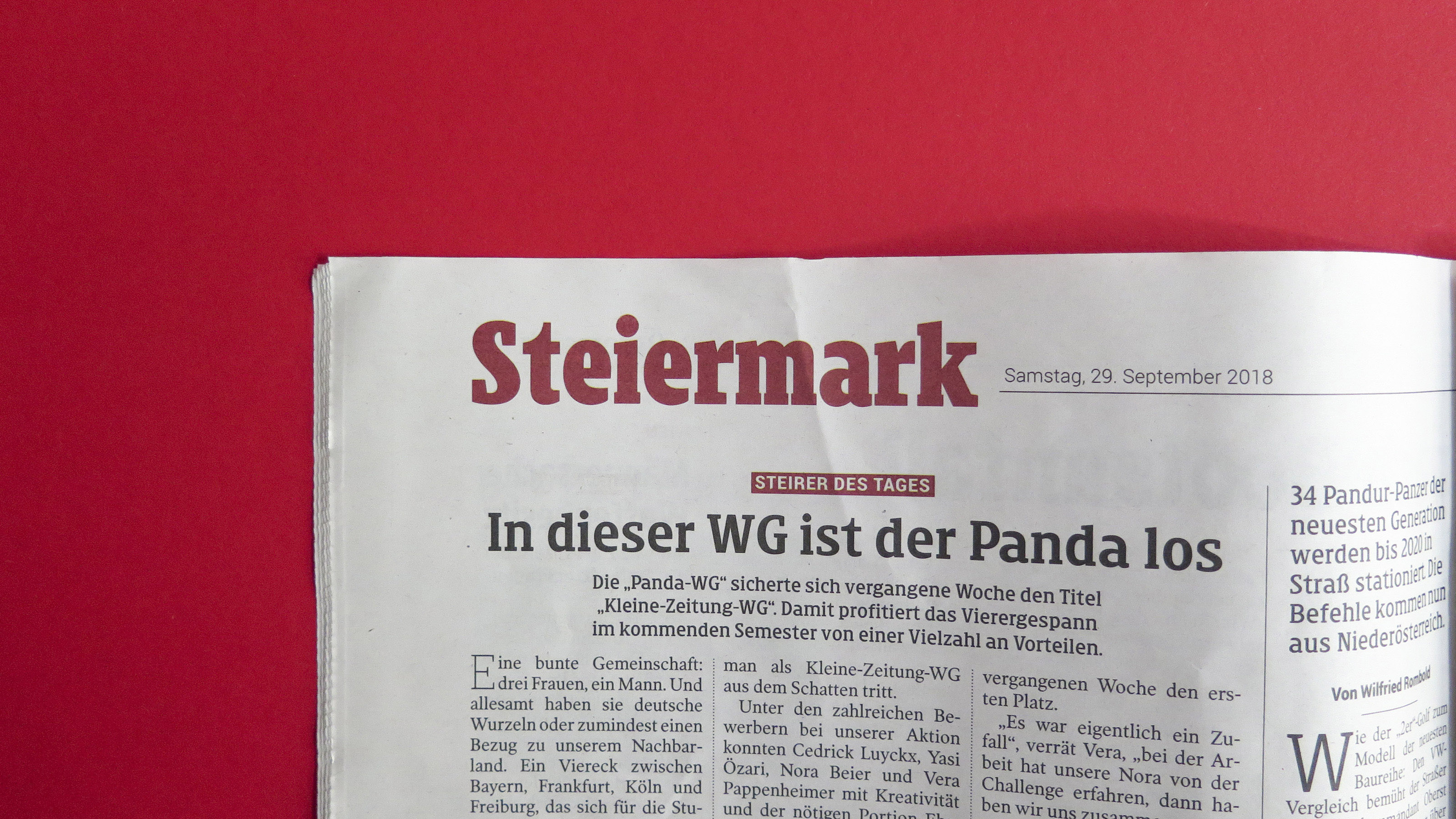
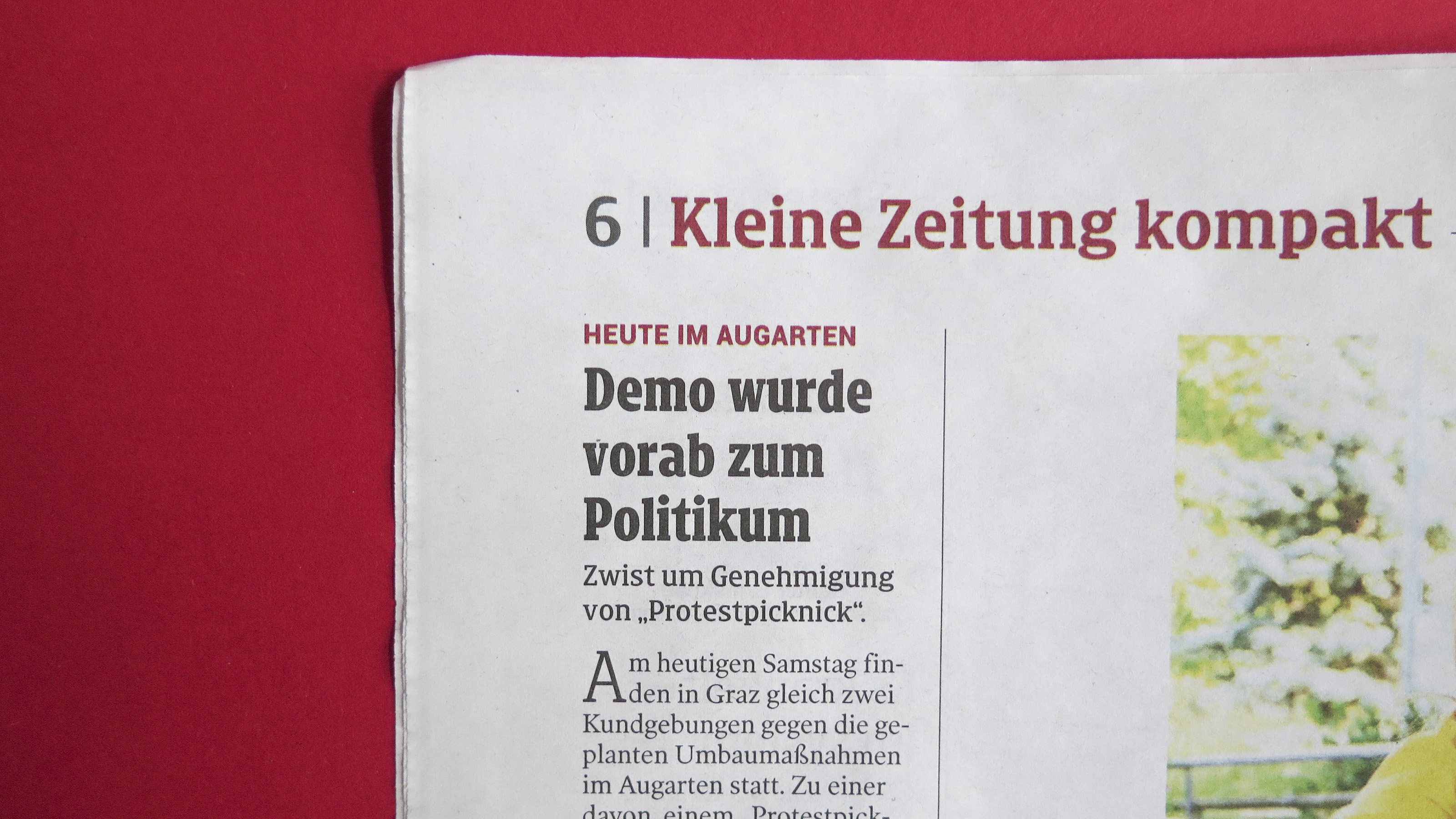
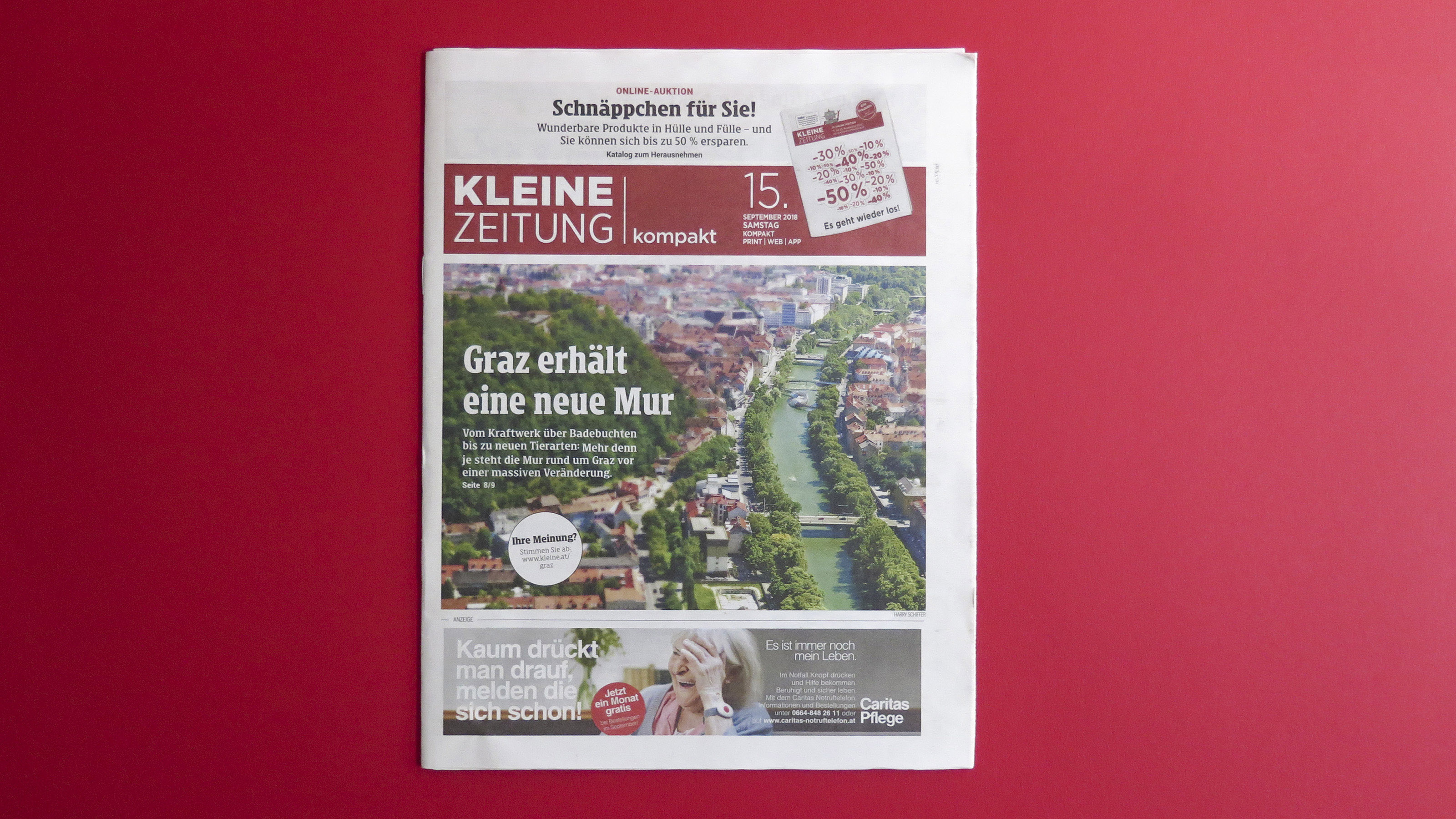
Kleine Zeitung is the largest regional newspaper in Austria, covering Styria and Carinthia with East Tyrol. The paper has around 800,000 readers.
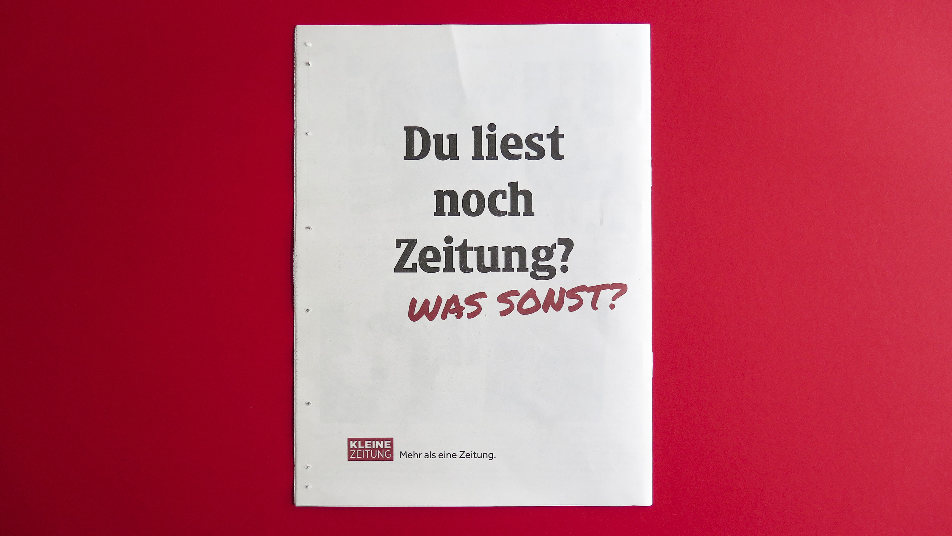
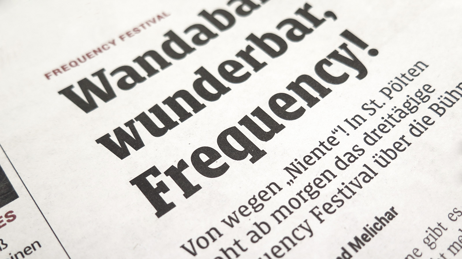
I had the pleasure to design a new headline typeface for one of the best selling newspaper in Europe.
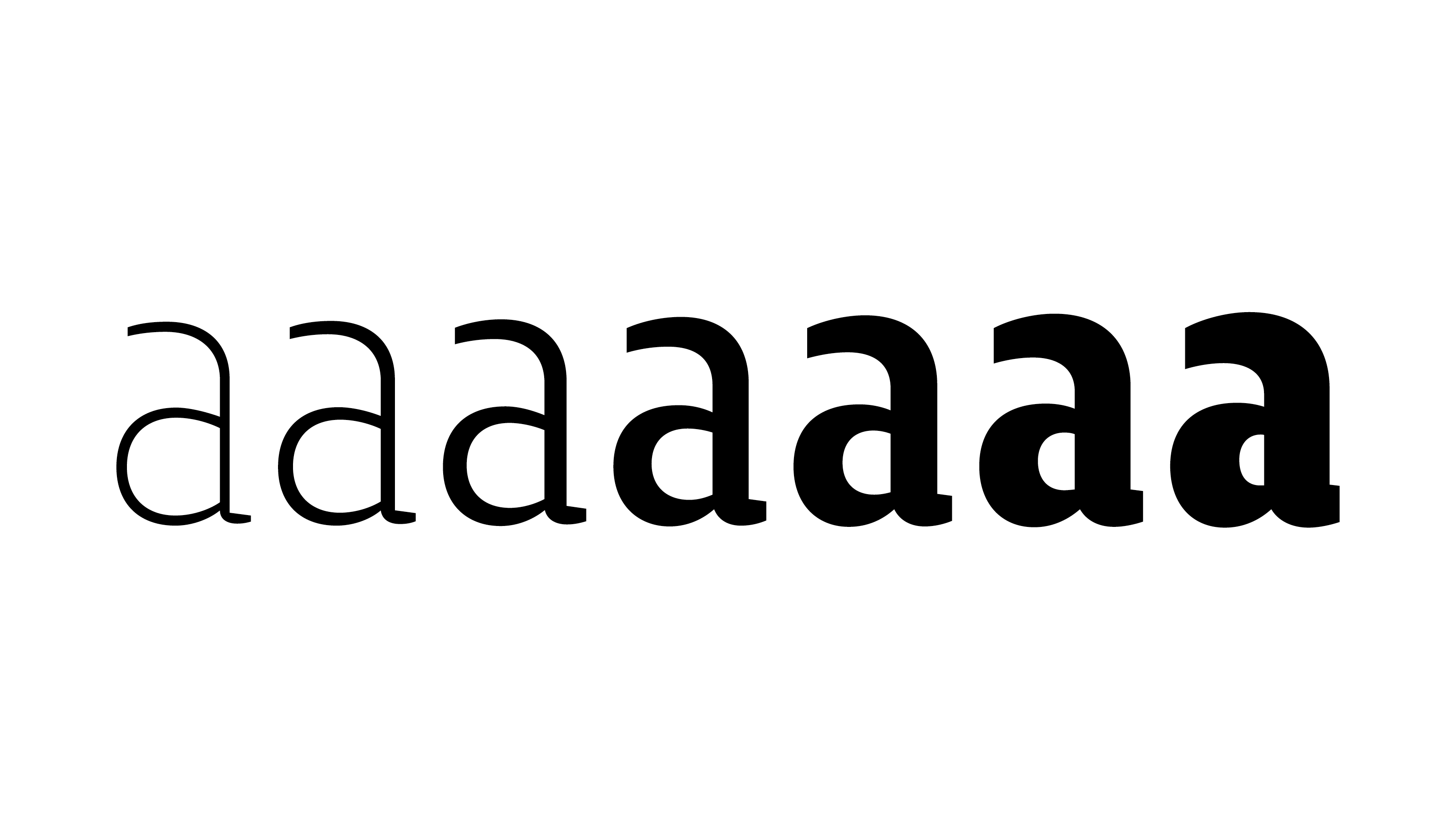
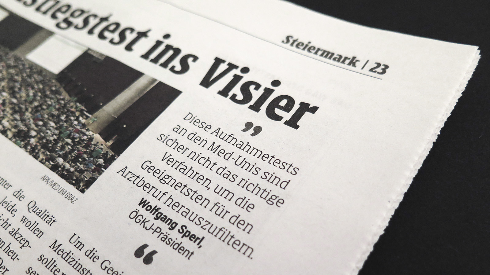
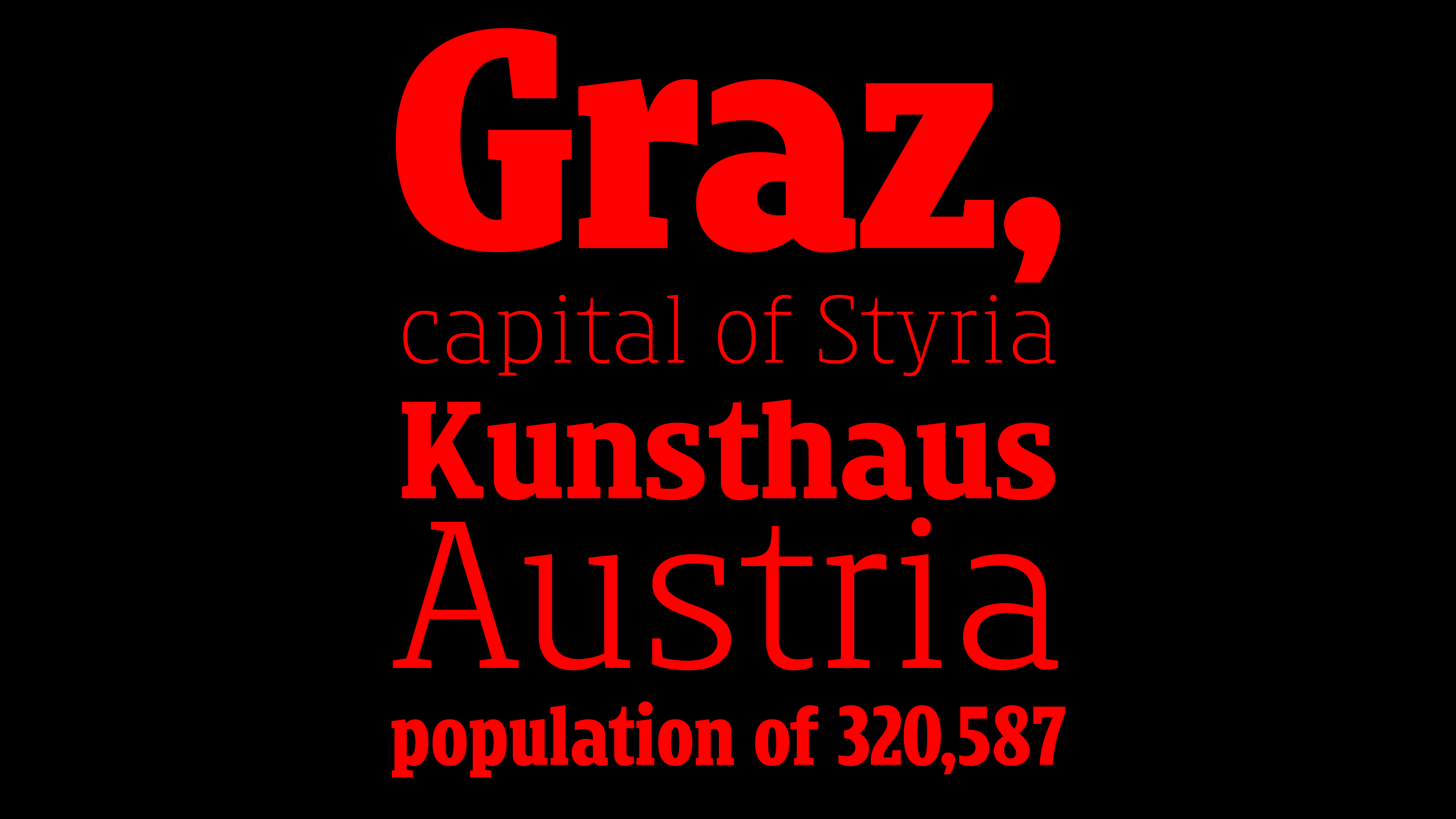
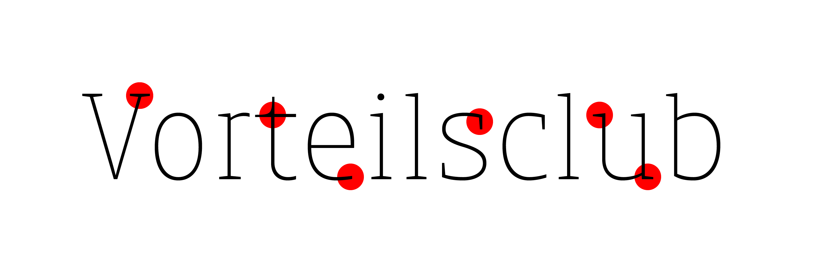
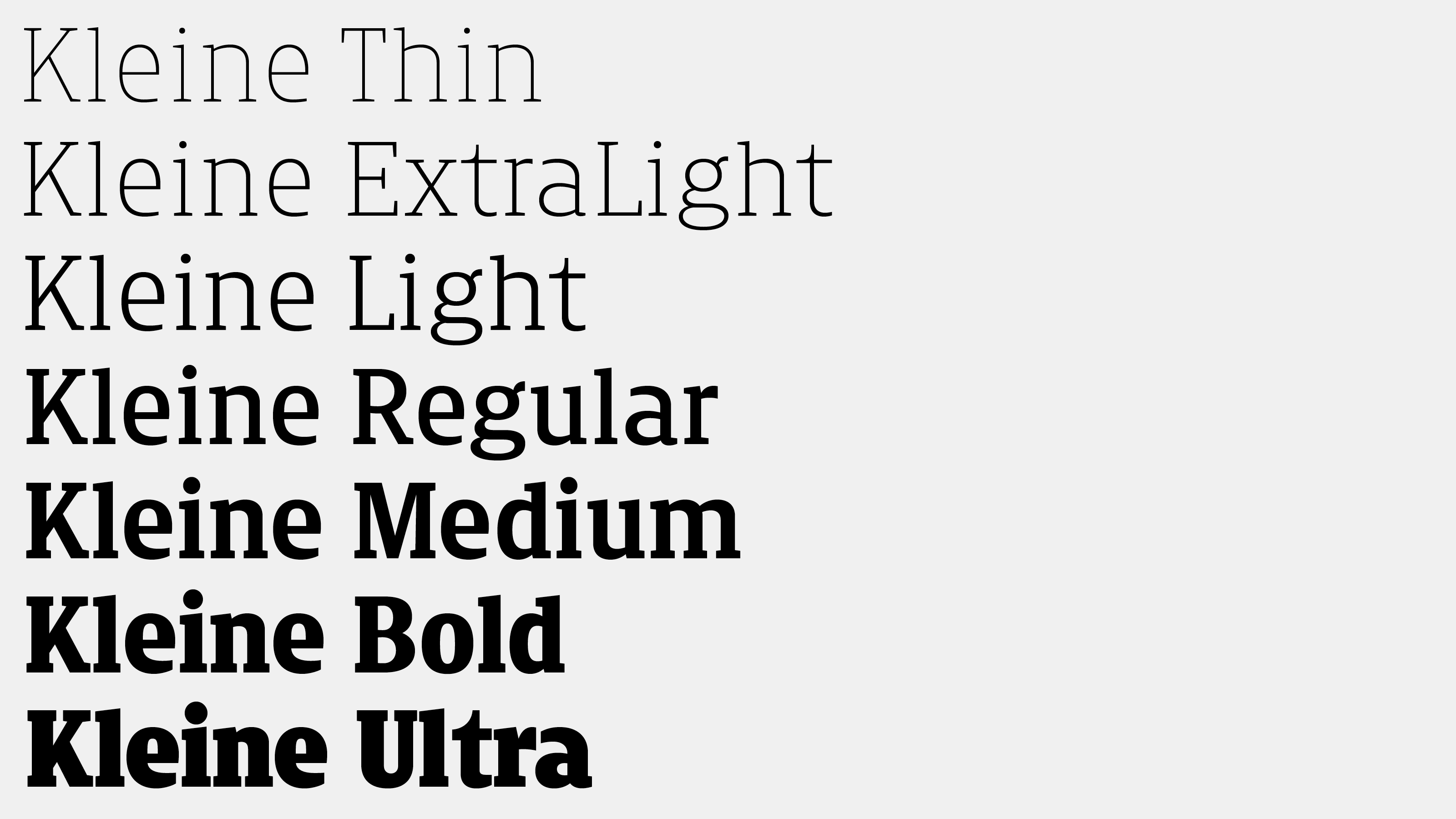
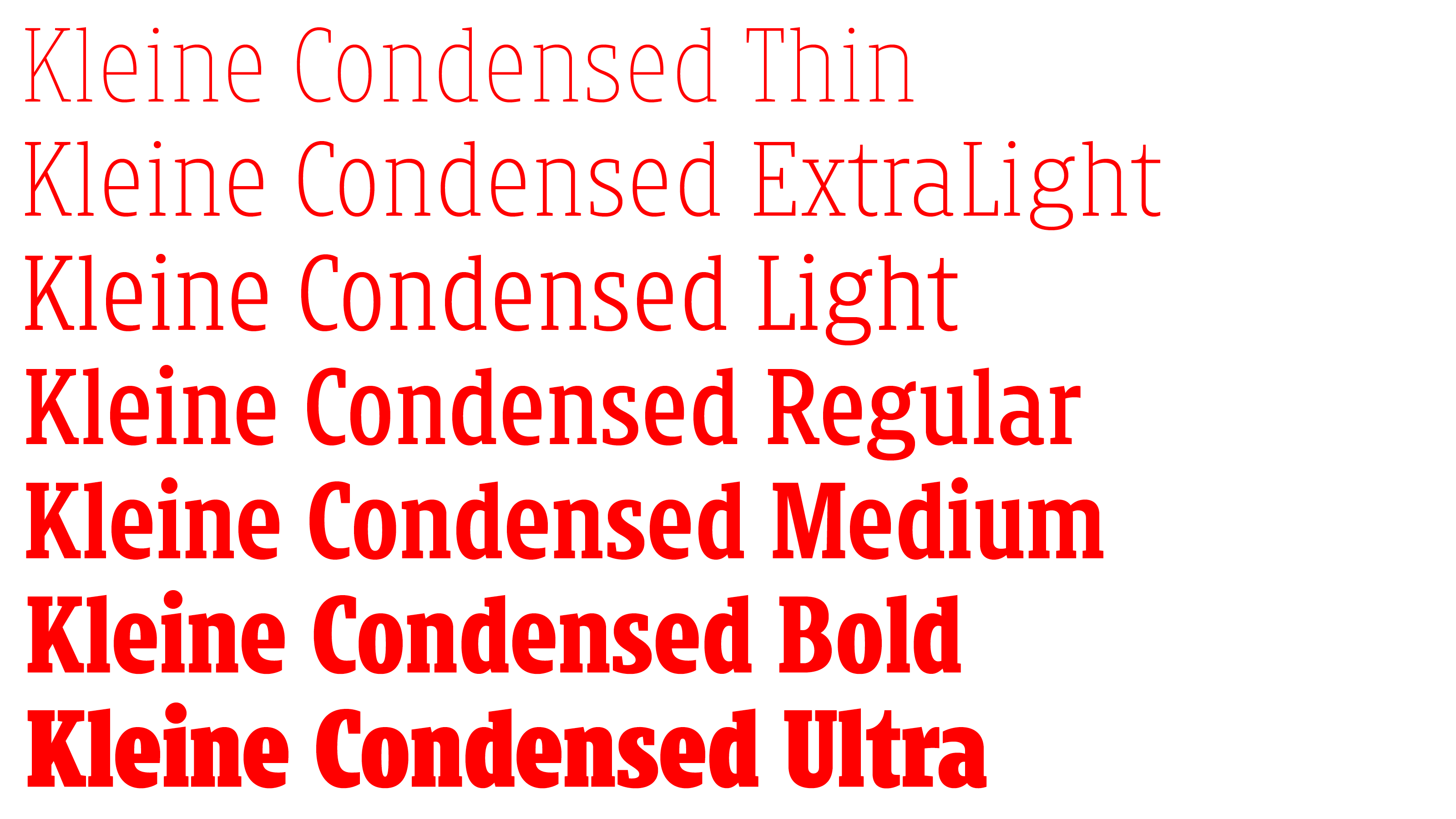
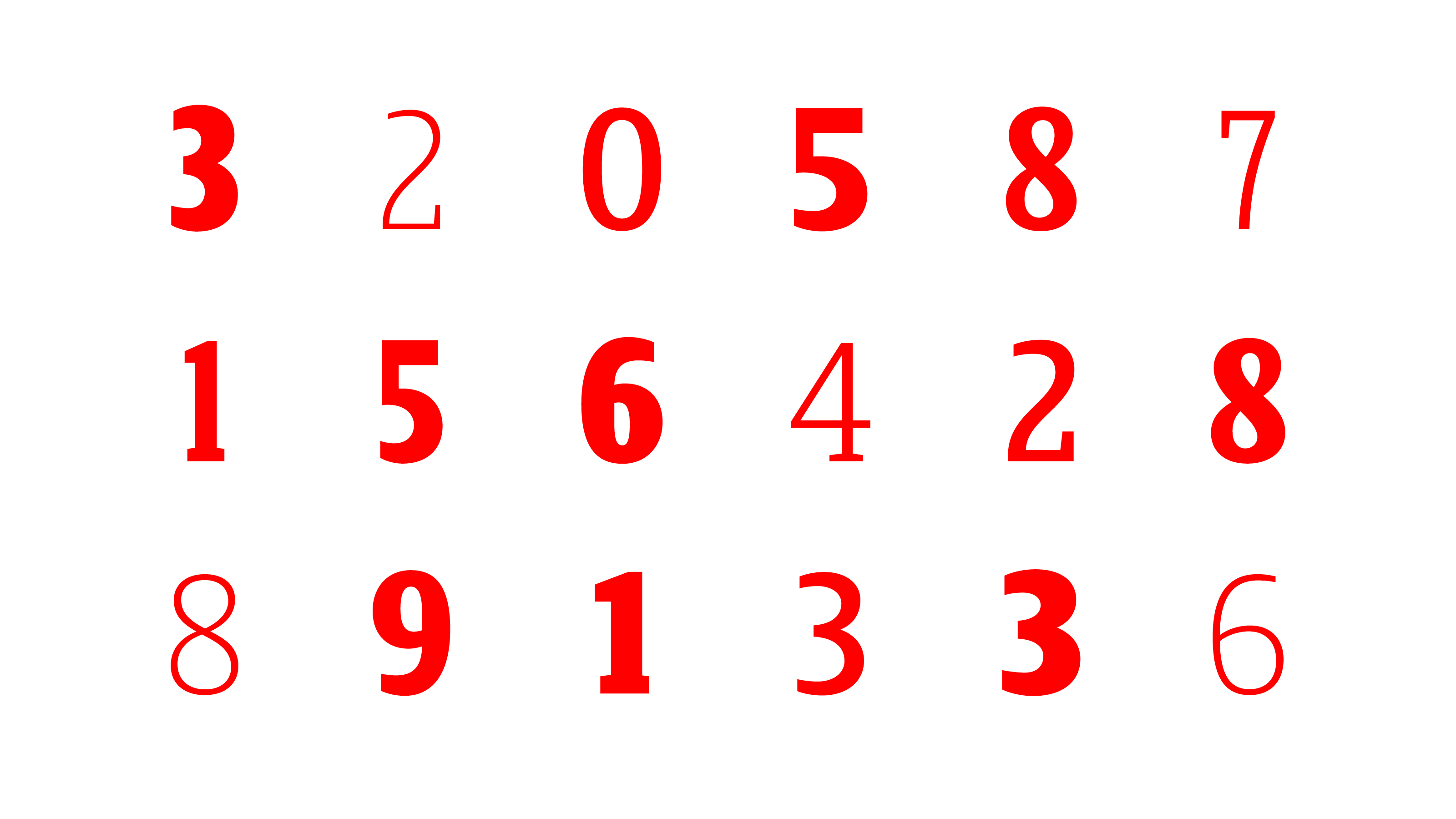
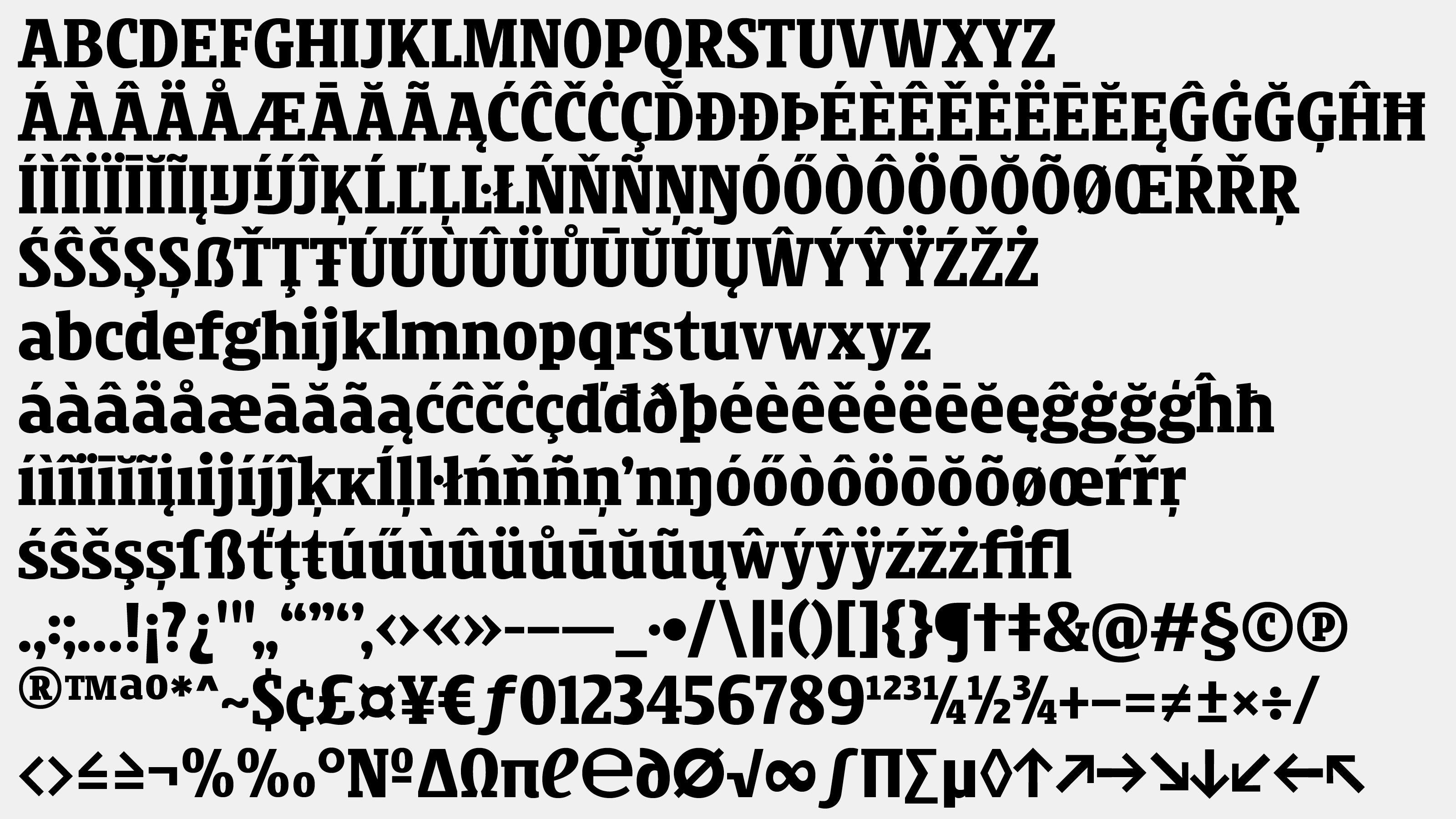
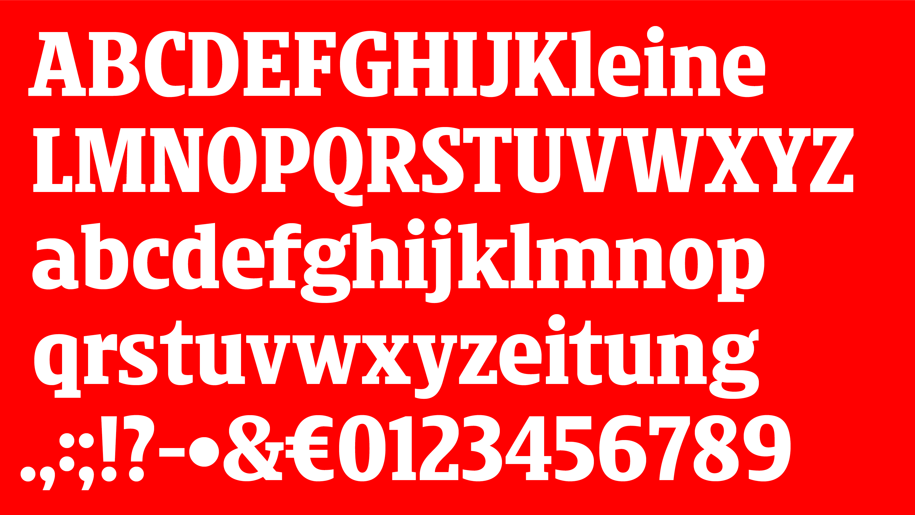
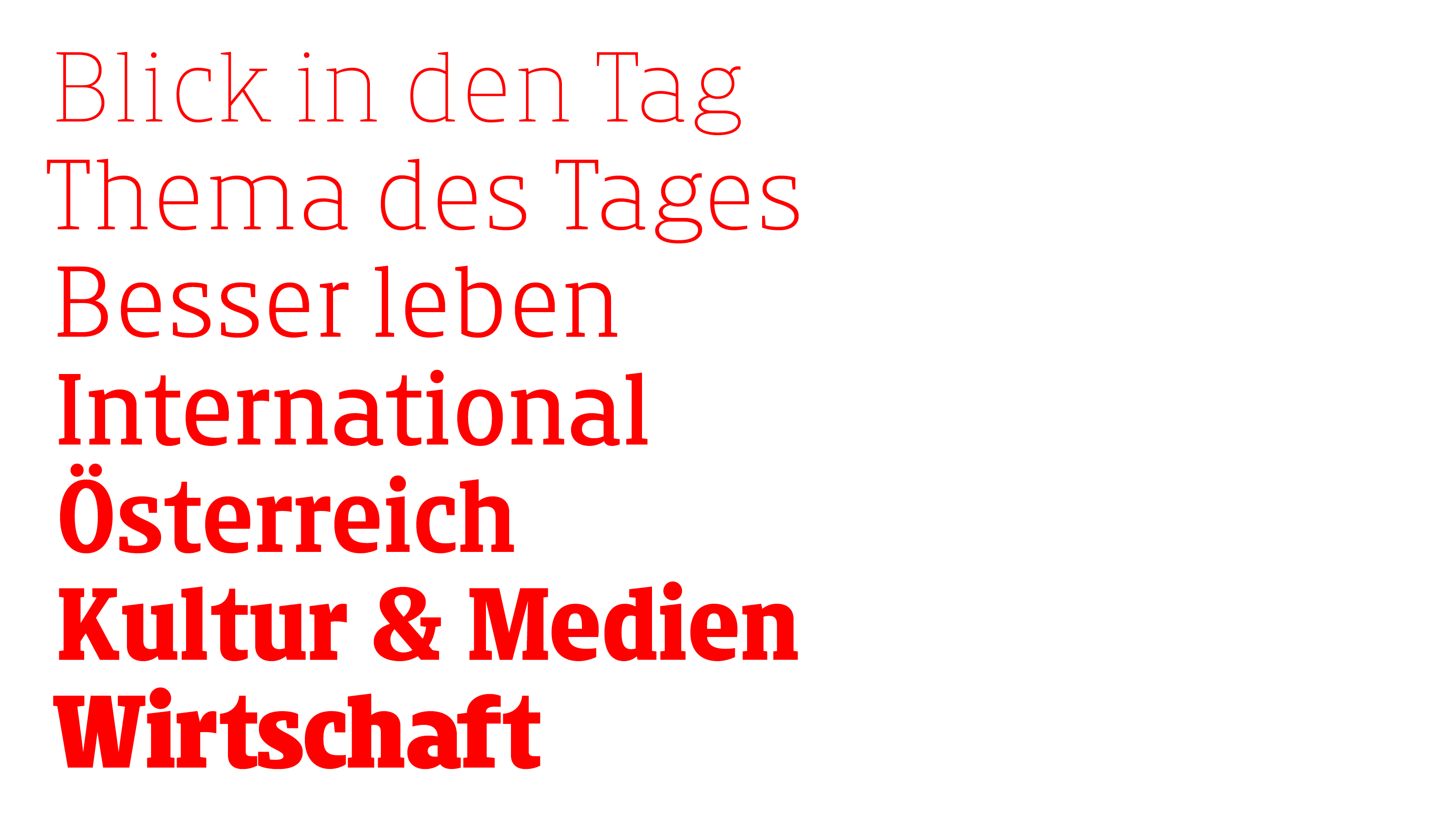
Kleine Titel has 7 weights from Thin to Ultra, in 2 weights (Condensed and Normal) alltogether 14 styles. In the newspaper we have a lot of text, but never enough space! To help the tighter type setting, but to avoid the clipping, the x-height is larger, than usual, the letters are very compact. To emphasize the headlines in the newspaper the serifs are massive, but not too heavy. The paper of the newspaper is not totally white, so the contrast of the letters is low. For better legibility the shapes have more white space in- and around, that’s why the apertures are large and the shapes are open.
Kleine typeface is available for commercial use upon request.
Client: Kleine Zeitung GmbH & Co KG
Art director from Kleine Zeitung: Erich Repe
Kleine Titel won GOLD at Joseph Binder Award 2018 in Type Design category!
Jury statement:
The »Kleine«, which means »the small one« in German, is a great tightly spaced typeface that has been wonderfully inflected in all of its details. Through the skilful use of serifs the font has received a great deal of individuality and powerful expression. It has thus given the newspaper for which it has been created an unmistakable identity.